This project proved to be the most challenging one I have undertaken to date. I encountered obstacles that I found really frustrating and time-consuming, particularly during the chart creation phase where I struggled with using data to make various charts. Once I overcame these challenges, I found the remainder of the dashboard design process to be very enjoyable. The outcome that I produced made the time and effort invested in it worthwhile. I am extremely proud of my final outcome. Most of my design decisions were relievingly validated during a class critique.
Reflection
Dashboards
Overview
Users and target audience
Process
Results
Problem statement and goals
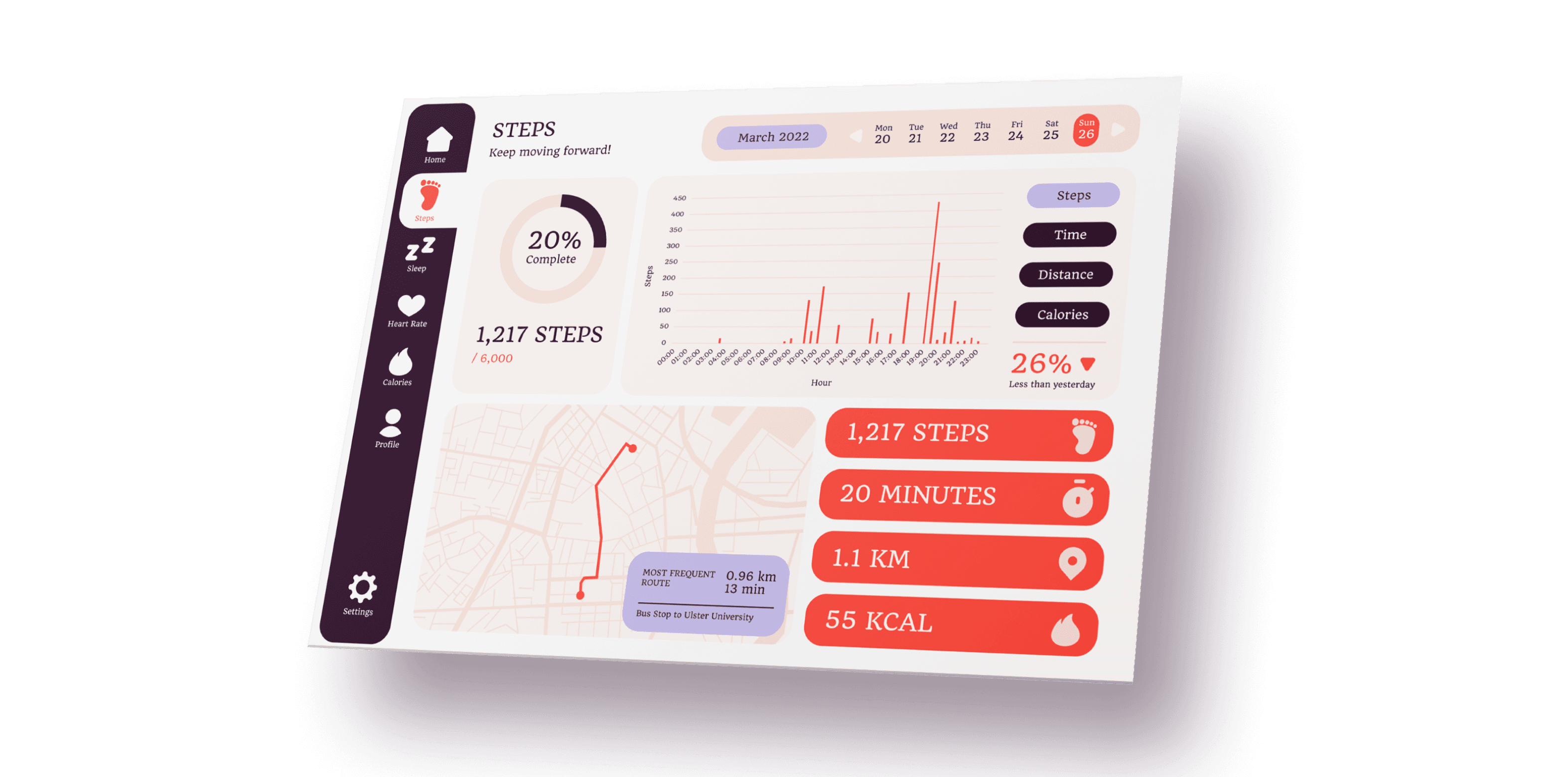
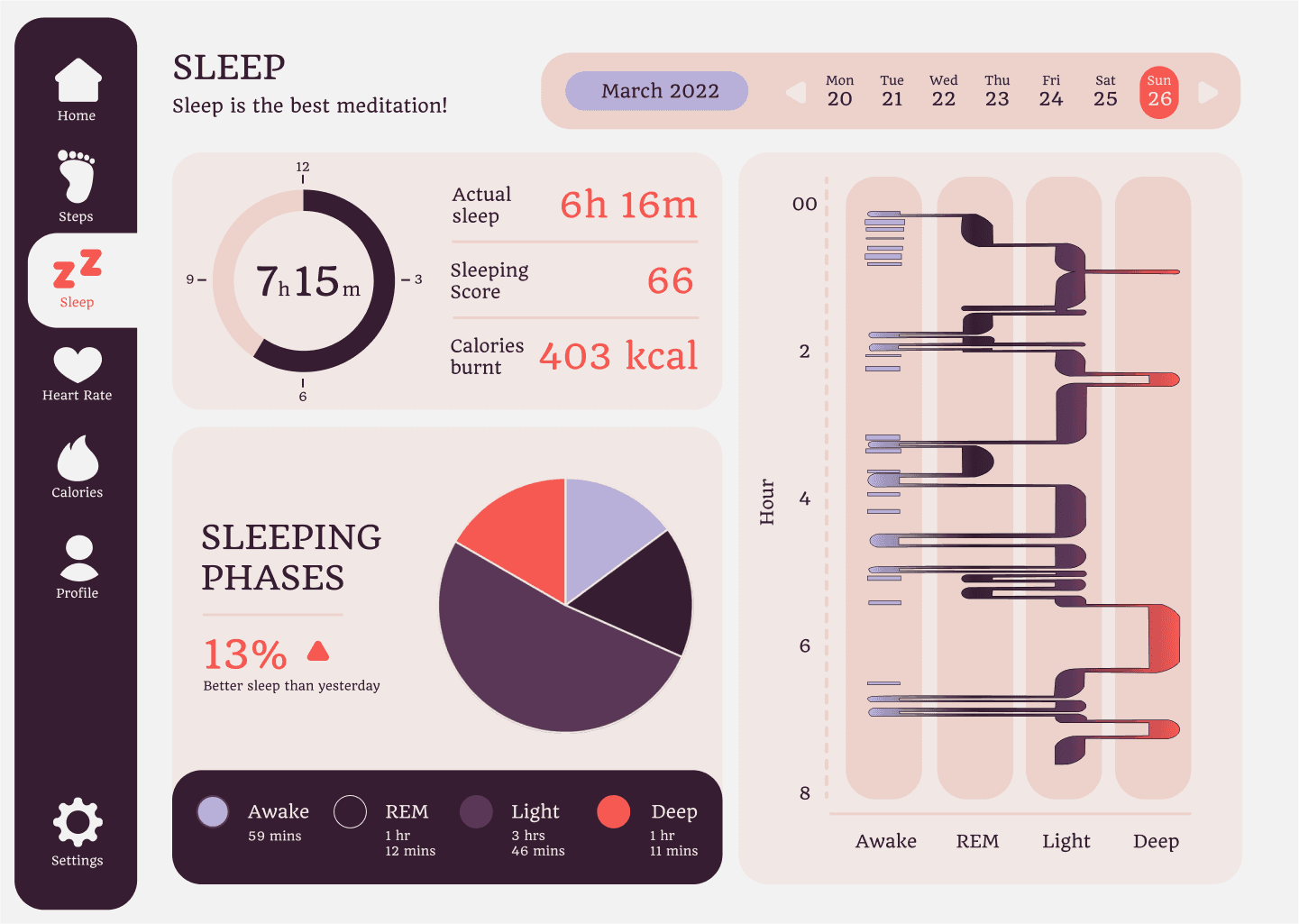
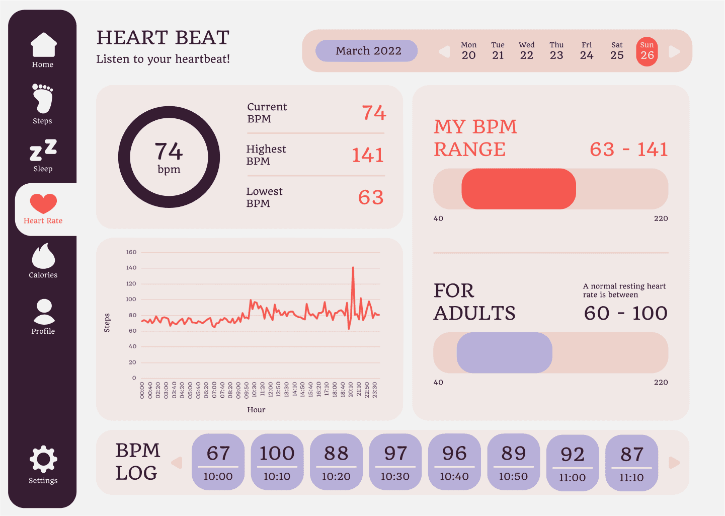
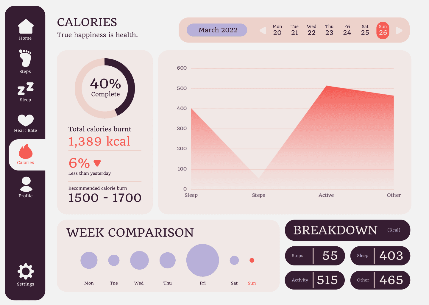
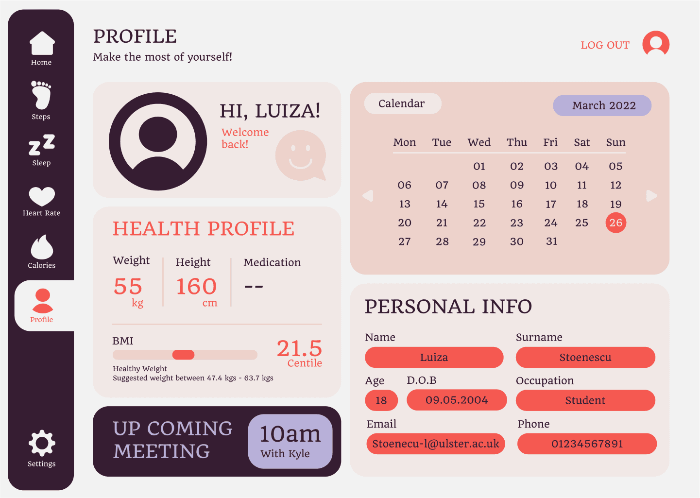
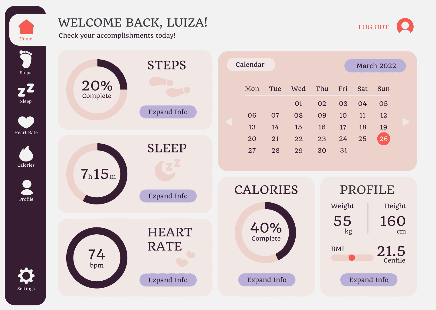
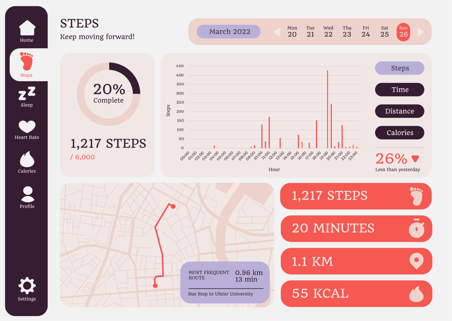
This assignment focuses on collecting and visualising a set of data. Making data and numbers easy to comprehend by showcasing visually through dashboards. This dashboard is a showcase of the health overview of a week in my life.
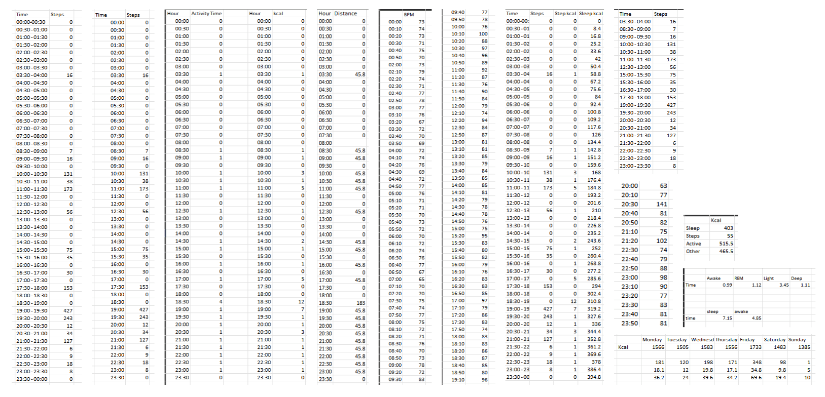
For anyone that is not myself, information about my week and health would be very difficult to understand. Information was initially only spreadsheets of data, which would not be exciting to anyone.
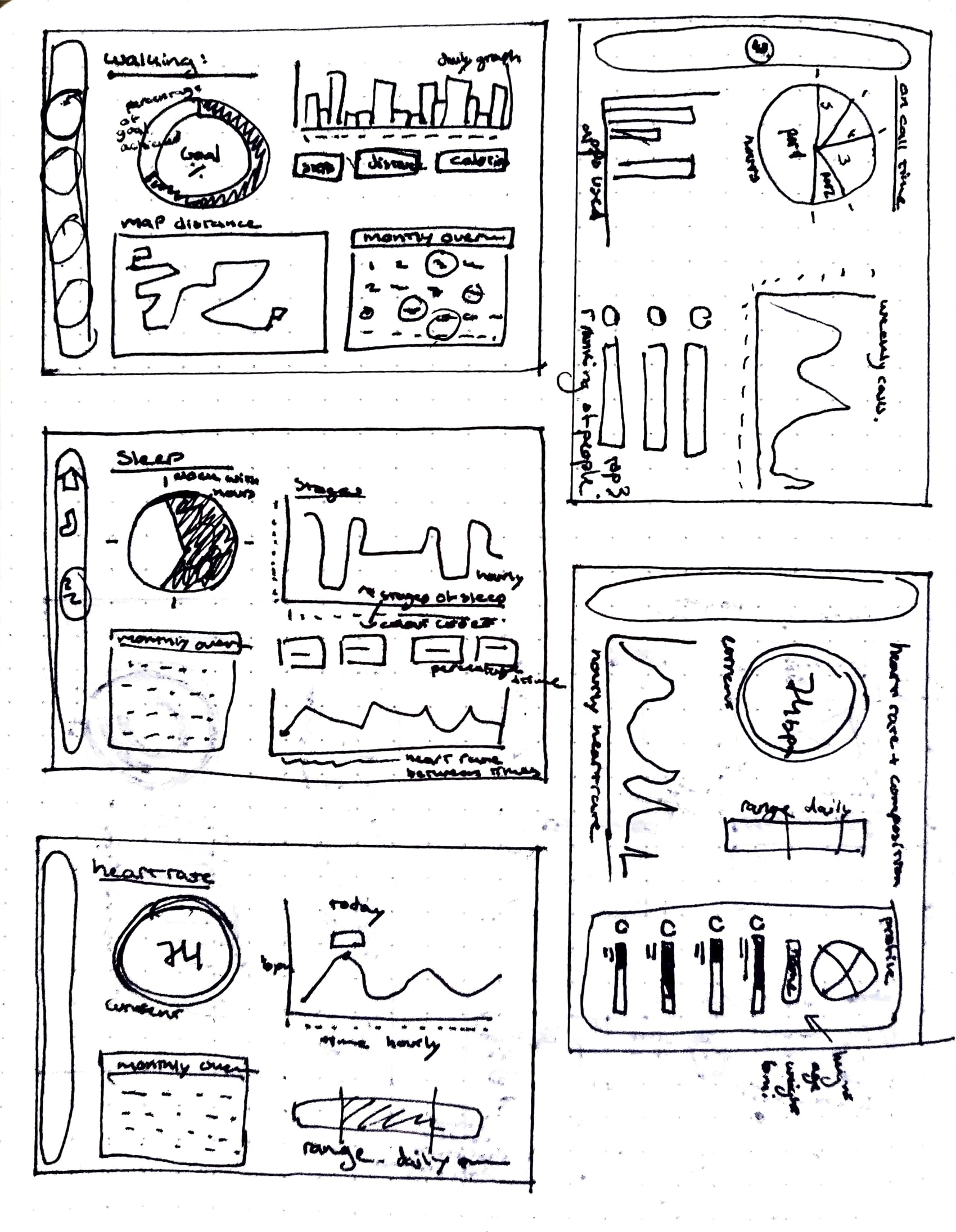
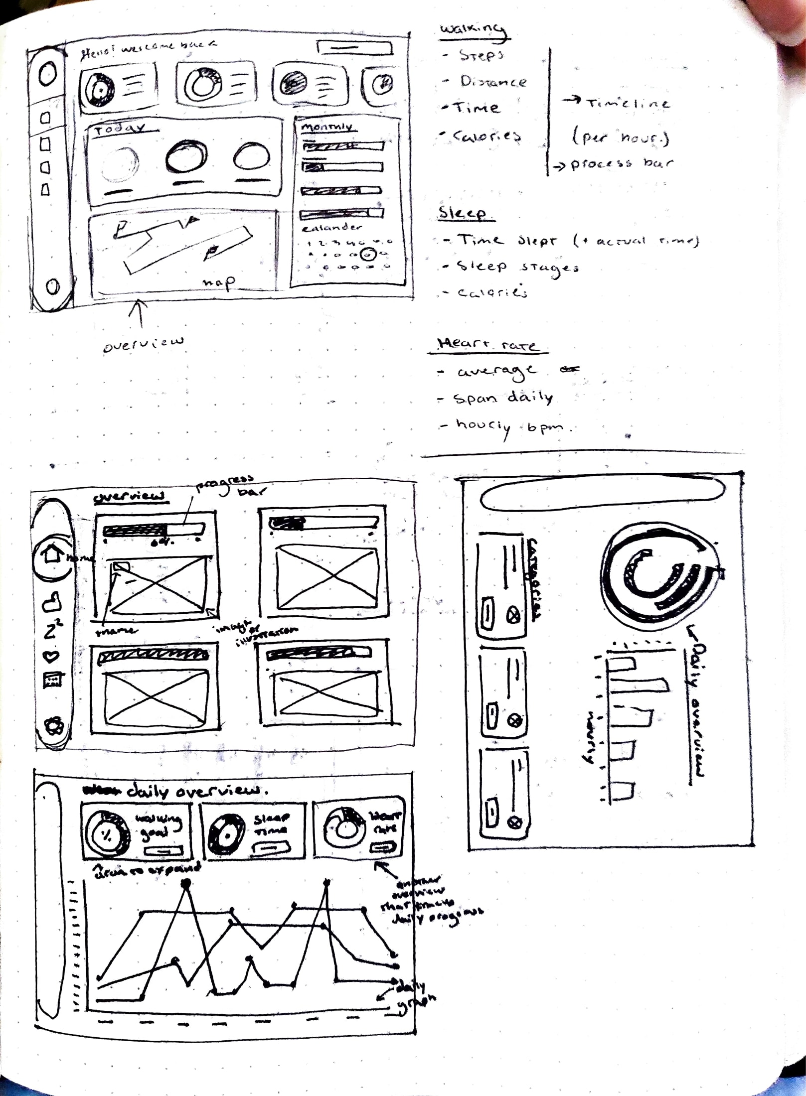
The process I undertook for this project had been different as it focused more on accumulating and presenting data. Creating charts was a challenging process as it required to contain a good visualisation of a lot of information, and had to be accessible and legible in scale. Colour accessibility was also a big concern as I had to go back and make drastic changes to my original design. Nevertheless, I was able to overcome these issues and create an effective design.
Without knowledge on a topic, amounts of data can be overwhelming and hard to understand. The goal of this projects is to communicate information in an easy way, that it much more appealing and interesting to look at.



Dashboards
Results
Overview
Users and target audience
Process
Problem statement and goals
This assignment focuses on collecting and visualising a set of data. Making data and numbers easy to comprehend by showcasing visually through dashboards. This dashboard is a showcase of the health overview of a week in my life.
For anyone that is not myself, information about my week and health would be very difficult to understand. Information was initially only spreadsheets of data, which would not be exciting to anyone.
Reflection
This project proved to be the most challenging one I have undertaken to date. I encountered obstacles that I found really frustrating and time-consuming, particularly during the chart creation phase where I struggled with using data to make various charts. Once I overcame these challenges, I found the remainder of the dashboard design process to be very enjoyable. The outcome that I produced made the time and effort invested in it worthwhile. I am extremely proud of my final outcome. Most of my design decisions were relievingly validated during a class critique.
The process I undertook for this project had been different as it focused more on accumulating and presenting data. Creating charts was a challenging process as it required to contain a good visualisation of a lot of information, and had to be accessible and legible in scale. Colour accessibility was also a big concern as I had to go back and make drastic changes to my original design. Nevertheless, I was able to overcome these issues and create an effective design.
Without knowledge on a topic, amounts of data can be overwhelming and hard to understand. The goal of this projects is to communicate information in an easy way, that it much more appealing and interesting to look at.


Dashboards

Overview
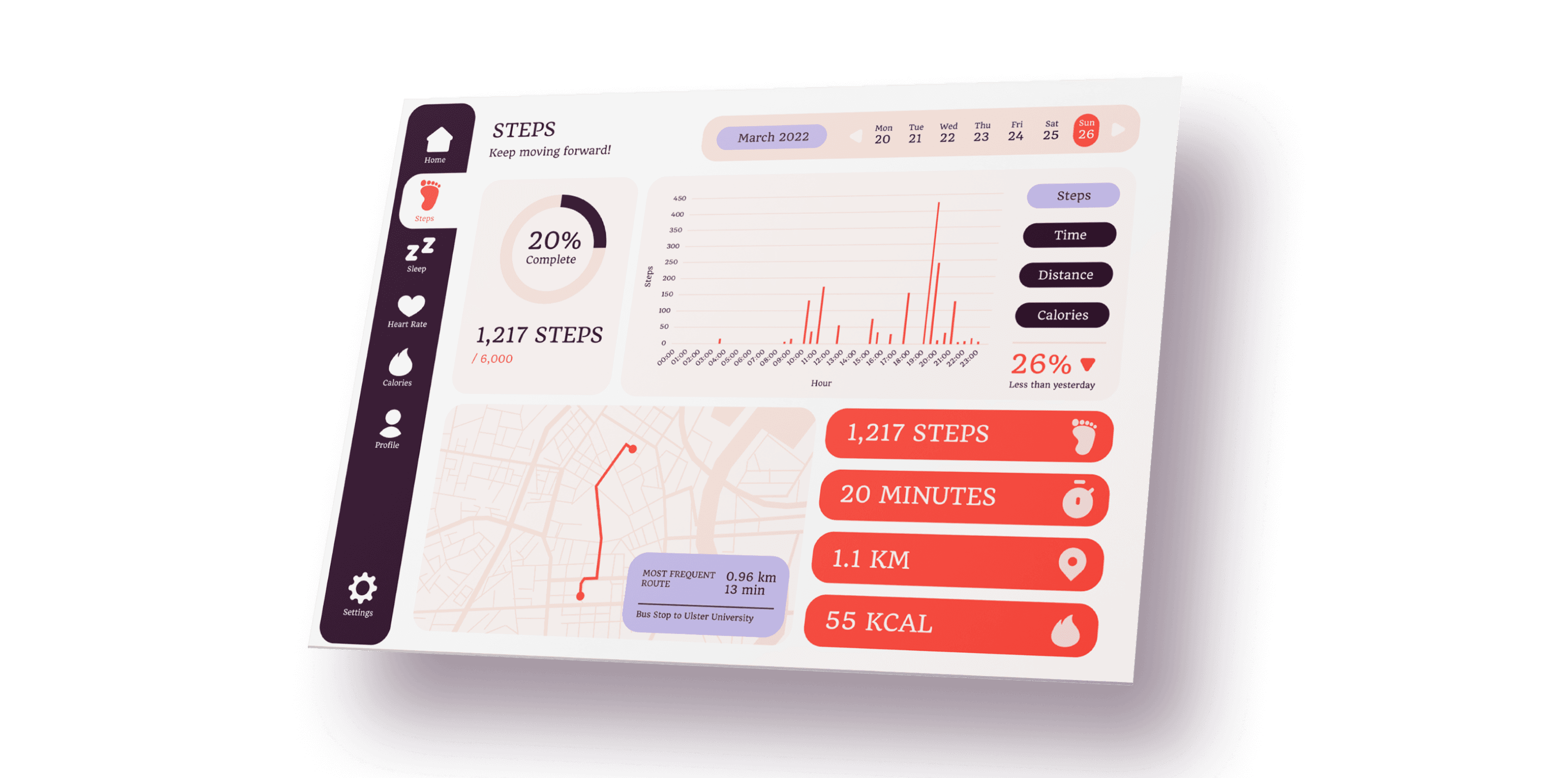
This assignment focuses on collecting and visualising a set of data. Making data and numbers easy to comprehend by showcasing visually through dashboards. This dashboard is a showcase of the health overview of a week in my life.
Problem statement and goals
Without knowledge on a topic, amounts of data can be overwhelming and hard to understand. The goal of this projects is to communicate information in an easy way, that it much more appealing and interesting to look at.
Users and target audience
For anyone that is not myself, information about my week and health would be very difficult to understand. Information was initially only spreadsheets of data, which would not be exciting to anyone.
Process


The process I undertook for this project had been different as it focused more on accumulating and presenting data. Creating charts was a challenging process as it required to contain a good visualisation of a lot of information, and had to be accessible and legible in scale. Colour accessibility was also a big concern as I had to go back and make drastic changes to my original design. Nevertheless, I was able to overcome these issues and create an effective design.
Results


Reflection
This project proved to be the most challenging one I have undertaken to date. I encountered obstacles that I found really frustrating and time-consuming, particularly during the chart creation phase where I struggled with using data to make various charts. Once I overcame these challenges, I found the remainder of the dashboard design process to be very enjoyable. The outcome that I produced made the time and effort invested in it worthwhile. I am extremely proud of my final outcome. Most of my design decisions were relievingly validated during a class critique.
Dashboards

Overview
This assignment focuses on collecting and visualising a set of data. Making data and numbers easy to comprehend by showcasing visually through dashboards. This dashboard is a showcase of the health overview of a week in my life.
Problem statement and goals
Without knowledge on a topic, amounts of data can be overwhelming and hard to understand. The goal of this projects is to communicate information in an easy way, that it much more appealing and interesting to look at.
Users and target audience
For anyone that is not myself, information about my week and health would be very difficult to understand. Information was initially only spreadsheets of data, which would not be exciting to anyone.
Process


The process I undertook for this project had been different as it focused more on accumulating and presenting data. Creating charts was a challenging process as it required to contain a good visualisation of a lot of information, and had to be accessible and legible in scale. Colour accessibility was also a big concern as I had to go back and make drastic changes to my original design. Nevertheless, I was able to overcome these issues and create an effective design.
Results


Reflection
This project proved to be the most challenging one I have undertaken to date. I encountered obstacles that I found really frustrating and time-consuming, particularly during the chart creation phase where I struggled with using data to make various charts. Once I overcame these challenges, I found the remainder of the dashboard design process to be very enjoyable. The outcome that I produced made the time and effort invested in it worthwhile. I am extremely proud of my final outcome. Most of my design decisions were relievingly validated during a class critique.